Sainsbury’s (UX&AI Bootcamp)// Speeding up self service checkout flow
Product Design
Duration: 1 Day
Brief
Sainsbury’s believe speeding up the self-service checkout flow will increase revenue, they are planning to remove the scales, and they would like to review the experience to see if there are further improvements that can be made to speed up the flow.
Business Goals: Sainsbury’s want to increase revenue.
User Pain Points: Unknown
My process
With a day to explore this project the job here was to quickly establish how to achieve business goals in a way that improved the users experience of the checkout flow. Success would be to uncover a set of ideas on how the self-service checkout might be sped up. Whilst speed is the primary focus of the business, it’s important to note that speed isn’t necessarily an issue for the user, rather, I needed to consider how solving pain points for the user might speed up the checkout flow for the sake of the business creating a win-win outcome.
DISCOVERY
1. Searched online for comments about the check-out flow
I saw comments about being able to turn down the volume, interesting but not helpful. (I would have dived deeper but we had limited time on this) | Summarise what this did for your process, what were the key themes?
2. Filmed current flow and mapped out user journey
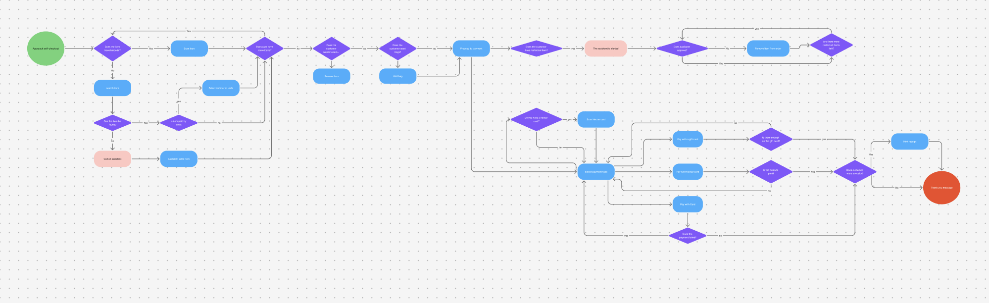
User Journey Map
My initial thoughts:
Why do we need a start button?
Is it necessary to have a screen to add bags? (I would have asked for data around how user are interacting with this screen
Should the payment screen default to card (I would have asked for data on the split between different payment types) or like the train ticket kiosk detect payment? (Given more time I would have gone and recorded the train ticket kiosk flow)
Small scanner significantly slower to use than larger one, it seems there is a strong case to sunset the smaller scanners.
3. Spoke to an employee in Sainsbury’s about the issues they have with the till
They said their biggest issue with the till is that users are unable to scan an item once and increase the quantity (ie; they have 10 identical cans of tuna) they often run into issues scanning high quantities of the same item and call for assistance.
4. Filmed the experience in other stores to compare
My initial thoughts:
Do we need a ‘do you want to print receipt’ screen?
Why does calling for/needing assistance stop the flow?
Tesco’s accessibility features are far superior
IDEATION
Solutions I’d chose to explore
Removing the start button
Allowing users to continue scanning items whilst they’re waiting for assistance.
Remove the add a bag screen.
Default to card payment.
Remove the ‘do you want a receipt screen’
NEXT STEPS
I need to finish the prototype so I can get some feedback.
Takeaways
Really improved my approach to user mapping,
Sped up (Doing it in a short amount of time improved my ability to prioritise)
Learned how to put UI aside and focus on content first